Is Your Website Responsive? Why Mobile Friendly Sites Are Important and How to Check If Your Site Meets the Standard
By all accounts, it seems like the future of the web is mobile. In 2016, mobile usage surpassed desktop for the first time ever. Despite this, as many as 91% of small and mid-sized business websites are still not mobile-friendly. This leads to bad user experiences and loss of opportunity for many of the businesses.
According to a study by Econsultancy, 62% of companies that designed their websites to be mobile friendly had an increase in sales. So why not create a website that is optimized not only for mobile but for all the devices in between?

That’s where responsive design comes in. Responsive design is an approach to creating websites that allows for the site to work and look good on any device, from the largest TV screen to the latest smartphones. It uses HTML, CSS, and sometimes JavaScript to optimize a website to the user’s screen.
Responsive design shouldn’t be confused with the now antiquated mobile-only site. A responsive design requires that you only have one website and that it is coded to adapt to all screen sizes, regardless of which device is being used. The mobile-only site template is technically a completely separate website that requires the business to have a second subdomain that should only be accessed from mobile devices and is not optimized for different screen sizes.
Do you really need a responsive website?
In short, yes. Today, most people are using their mobile devices to browse and search on the web.
A study by Tyton Media revealed that 94% of people cited bad web design as the reason they mistrusted or rejected a website. Google’s Think Insights has even stated that if a user becomes frustrated with the mobile experience on a site, there’s a 61% chance that they’ll leave immediately and go to another site, often a competitor. Ensuring that your website works well and looks good on any device increases the chances that your visitors will stay longer, engage more, and even have more conversions.

Furthermore, Google announced that they’ve adjusted their search results to favor mobile-friendly sites. Google’s Pierre Farr even went on record to declare that Google’s algorithm favors responsive sites to mobile-only templates.
Need another benefit of a responsive website? Responsive designs should not only adapt to current devices but also future ones because the site is designed to take screen size into account not just type of device. This means that regardless of what crazy screen dimension becomes popular next, the website will display properly.
Responsive Techniques
At MG, we use a mobile-first approach when designing and programming new websites. Our designers and developers work together to wireframe, or outline, websites and place a strong emphasis on user experience and interaction (UI/UX). Once they identify basic elements, designers modify the designs and create mock-ups for a range of flexible screen sizes to help guide the programmers on functionality and look.
During development, it’s important that layouts are fluid. Everything from image and font sizes to navigation structure may change depending on the screen size to ensure a quality user experience. Techniques like using percentages instead of fixed widths and .SVG images instead of fixed-height .JPEGs are important steps to not only making a website responsive and SEO friendly but also making it faster on mobile devices.
Programmers also use tools like Media Queries, CSS3 Modules that allow you to add rules for hiding, showing, moving, or adjusting the size of content according to device sizes and screen resolutions. For example, using media queries, a programmer can choose to hide an image on mobile devices. These tools allow for better user experiences and easier navigation on every device.
Is your site responsive? Test it!
Not sure if your website is responsive? We created a tool to help you visualize what your site looks like on different devices! Visit ResponsiveDesignChecker.com, enter your URL, and click Go.
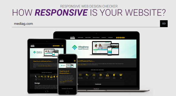
There’ll you’ll be able to select from a plethora of different devices and common desktop sizes, as well as enter your own custom size for review.
Get ahead of the curve!
Many smaller businesses have yet to address the issue of website responsiveness. It’s important to get an edge and stay ahead of the competition with a more professional website and responsive design.
Today, web development is not about one-size fits all solutions. It’s about taking advantage of the opportunities presented by new technologies and using them to create meaningful experiences for your clients.
.png)