Typeface Tango: How to choose the proper fonts for your website
The typeface on a website is an important part of how a site will be perceived and how effective it will be. Understanding the basics of typefaces and how they work with websites is pertinent to having an effective content message and cohesive design.
There are a number of things to assess and understand when choosing an effective typeface. How text displays on your site influences the look and feel of a design and, in turn, provides users with an understanding of the message of the company.
Font v. Typeface
First things first, are typefaces the same thing as fonts? Nowadays, it depends on who you ask. Although many experts agree that these terms can be used interchangeably now, there was a bigger difference before.
In traditional analog printing, a font was a certain size, weight, and style of a typeface that was cast in metal. For example, Bodoni was the typeface. However, you couldn’t just buy a metal cast of Bodoni, instead you had to buy a specific font; perhaps Bodoni Bold at 12 points.
Simply put, a typeface is a family of fonts. With the digital era however, the distinction between the two terms and their processes got muddled. Today, most people don’t know the difference and it may not matter anymore.
Serif v. Sans Serif
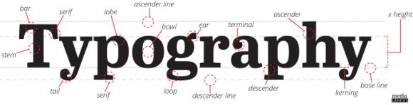
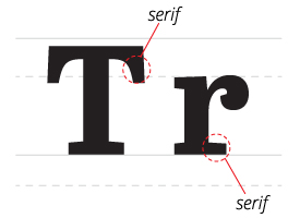
Serifs are the small line that branch off of the stroke in a letter. The word Serif comes from the Dutch word schreef, meaning “line”. They provide a visual connection from one letter to the next and aid in readability. Serifs are a traditional and dominant choice for a typeface. However, issues can arise with lower resolution displays that cause the serifs to become difficult to read.
Sans comes from the French word for “without”. Therefore, a Sans Serif is without a Serif. A Sans Serif is any typeface without a line branching off of the letters stroke. Sans Serifs are best for digital displays of text. They stay crisp and clean on displays with a lower resolution. Sans Serifs are also regarded as the better choice for readability across both old and new browsers and monitors.
Readability and Size
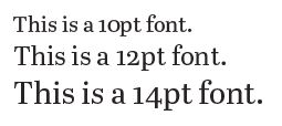
When focusing on readability, it is important to note how many characters there will be per line and the types of screens that will view the text, be it mobile, tablet, or desktop. The size of the screen you will work on will help you choose the best size for your typeface. Typically, body copy will be placed at 12pt. But a slightly larger size, about 14pt, can aid in readability. Size will also provide a differentiation between titles and body copy, giving the site a clear hierarchy.
Hierarchy
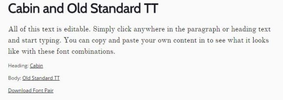
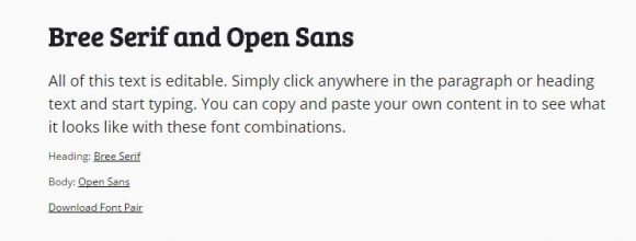
Choosing typefaces that contrast the background and options that provide a visual difference between titles and body copy, will give your site an effective hierarchy. The hierarchy of your text assists in delivering the correct message and tone of your body copy and can direct the user to important information. A bold typeface for titles and a mid-weight typeface for copy are often recommended for proper hierarchy. Below are some examples of combinations from fontpair.co.
*Sans Serif/Serif
*Serif/Sans Serif
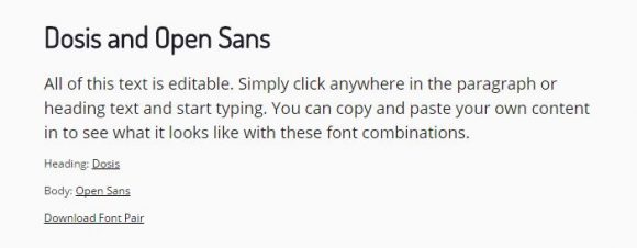
*Sans Serif/Sans Serif
Web Safe and Web Fonts
The most important part of choosing a typeface for the web is to ensure that all users will be able to view it as you do. All operating systems have pre-installed fonts, but these differ from system to system. Therefore, it’s important to use a web safe font stack. If the font on your site does not exist on the user’s operating system, it will be replaced by something similar to keep the style of your design intact.
The alternative to a web safe font is a web font. Web fonts are downloaded by the user’s browser while loading the page if it’s not pre-installed. This may slow the load time of the webpage, slightly affecting the user experience. As a back up to this method, it’s important to use a font stack which is similar to a web safe font stack. The browser will fall back on the web safe fonts in the stack if it cannot use the web font chosen on the site. It’s smart to choose a web safe font that matches the style of your site first for the stack, rather than a default typeface.
Worried about choosing the right font for your website? Call us! We specialize in designing and developing quality websites and brand guidelines.
.png)