CMP Real Estate Group: Branding
CMP Real Estate Group is a leader in the retail real estate industry in Southeast Michigan. Their excellent market knowledge coupled with their relationship-focused approach has allowed them to excel in their industry. Driven by their business-to-business model and core values, CMP provides the highest level of service to their clients.
Forming a New Corporate Identity
CMP came to Media Genesis for brand consultation and design services. They were heavily considering a company name change due to their recent and rapid growth. They were certain that they needed a new logo and professional materials, such as business cards and PowerPoint templates, to showcase their expertise. Additional requests included strengthening brand consistency across social media and modifying their commercial real estate sign.
The Value of a Name
Although CMP was unsure if they wanted to pursue a name change, they decided to fully complete the ideation process before making their decision. We kicked off the formal naming process with a benchmark analysis, identifying key competitors and common name trends in the industry. The benchmarking study uncovered the popular use of abbreviations and real estate related terms in company names.
This knowledge guided the standalone name ideation process in which we identified trustworthy industry terms that would act as a foundation for building the new company name. We created taglines that worked within the existing CMP abbreviation as well as several standalone options. This allowed us to determine strong name candidates and verify the availability of their domain names.
After presenting the name candidates to CMP, they deliberated and ultimately decided not to pursue a name change. The original CMP name holds a valuable history and meaning that management deemed too important to change. After deciding to stay with their name, CMP was excited to move onto designing a new logo.
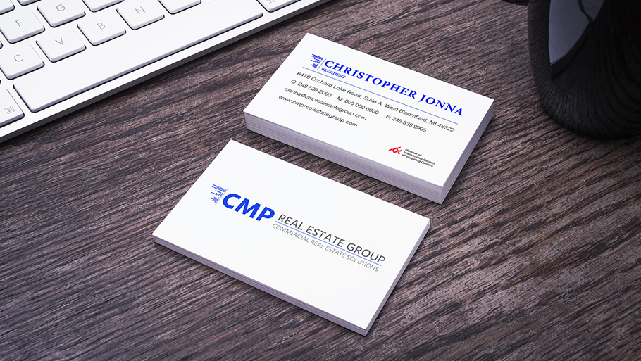
Representing a Company on Paper
For the logo design, CMP wanted their company name to be the focal point and did not want to deviate from their historical blue color. Our designers created logo options by interchanging fonts, taglines, and uniquely-designed icons. Each icon sought to evoke compelling themes, both abstract and concrete, such as trustworthiness, timelessness, and imagery of building complexes. CMP chose the icon that spells out “CMP Real Estate” in Morse code, which also resembles a skyline and connects with CMP’s mission of being a leader in the retail real estate industry.
We then re-designed their commercial real estate sign and created assets for their social media accounts. We also created a colorful banner that showcases CMP’s properties for them to add to their social media accounts. Lastly, we worked with CMP to design business cards and a PowerPoint template for their Leasing Presentation, which also display a CMP property on the front. CMP is excited to continue doing business with their new corporate identity.
.png)