The MG Illustration Process
Illustration can breathe life into any design. With respect to website design specifically, illustration and graphic design work harmoniously to instill both function and beauty to a website.
At Media Genesis, we’re fortunate enough to have two illustrators on staff who are also skilled graphic designers. Shown below is a behind the scenes look at the process as described by one of our on-staff illustrators.
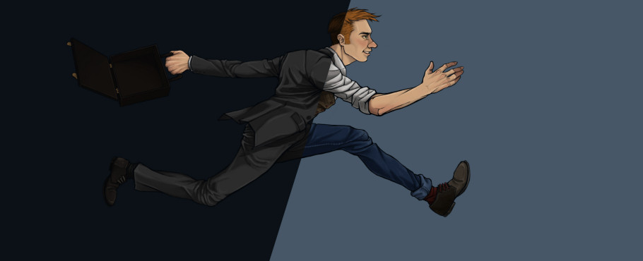
Phase I: Lines
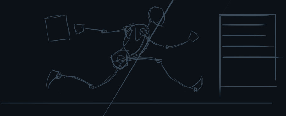
Using Adobe Photoshop on a Wacom tablet, I began with a solid-color background and a small, pressure-sensitive brush in a contrasting color. The composition of the image is sketched out with basic shapes and lines.
With the same brush in hand, I redefined the proportions of the figure. As a side note, understanding the anatomy of the subject is extremely important when working figuratively because any mistakes going forward will greatly impact the finished illustration.
Following the anatomy study, the character is built. At this stage, lines are cleaned-up and weight is added to show depth. This stage is all about the details.
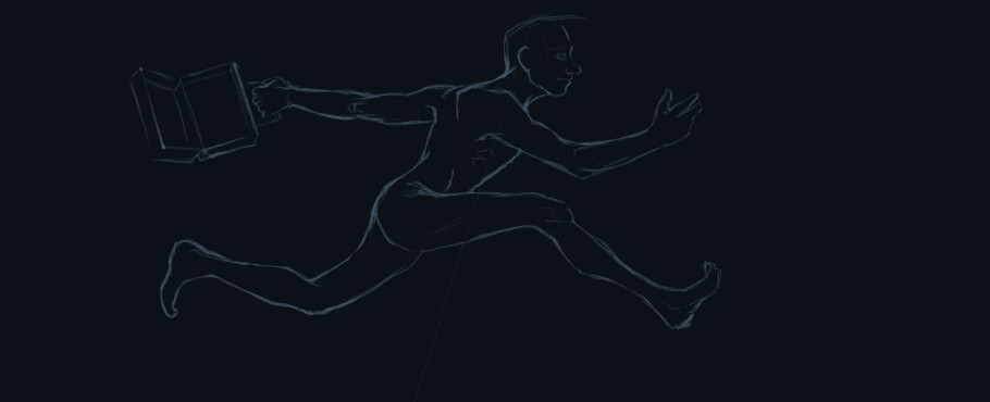
Phase II: Color
Using a lasso tool, flat colors are added. Once all of the flat colors are implemented, a light source can be specified. In this image, highlights were added to the forward sleeve using a transparent brush and a soft brush was applied to the face and arm in the same way. At this stage, the line work was isolated and a more appropriate color was applied to it.
Much like the sleeve and the arm in the last example, the remaining elements have been rendered with highlight and shadow. Each color is generally isolated onto its own locked layer so that painting on them will not affect other areas.
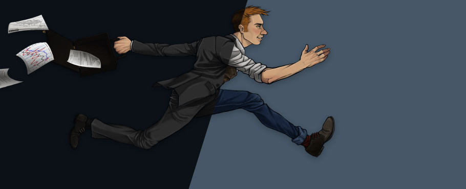
To finalize the illustration, details like the flying papers and a subtle drop shadow are added. The papers were created using distorted shapes with gradients and a random data overlay.
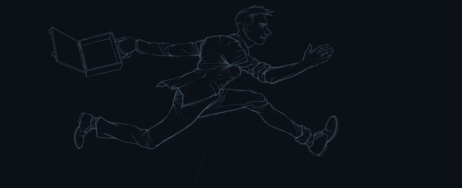
Phase III: Final Touches
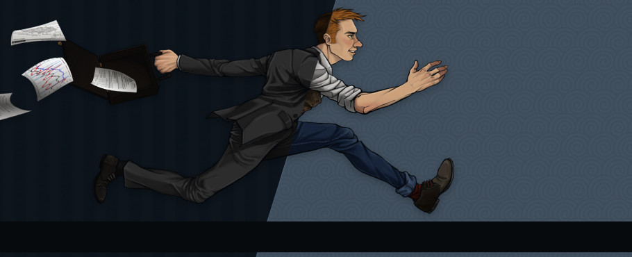
Texture was added behind the figure using an overlay, but can also be accomplished with soft light layer style and low opacity. The texture needed to be subtle enough so as to not detract from the figure, but interest enough to own the negative space. During this stage, a dark blue bar was placed below the figure to house the type treatment.
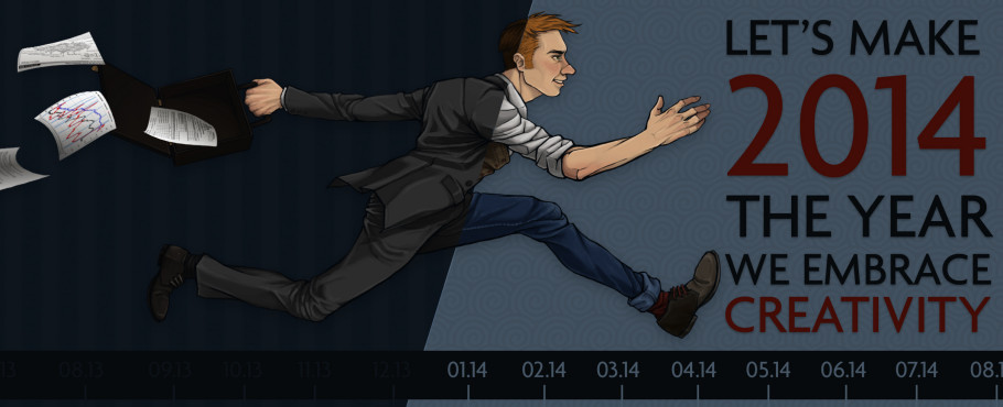
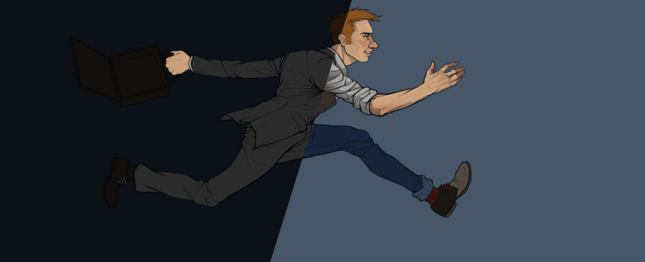
In the final stage, I added the type using colors from the illustration in a complimenting font. While the headline is bold and highly-legible, the dates at the bottom are decorative and were designed to blend into the background. The illustration is now finished.
As a side note, illustrations should be done in at least 300 dpi, but can be shrunk down to 72 dpi for web purposes.

.png)