Utilitec: Website Design and Development
Utilitec is a customer communications management company that specializes in the utility industry. Utilitec creates purpose-built solutions in a variety of categories, including customer engagement, bill redesign, data security, payment, and more.
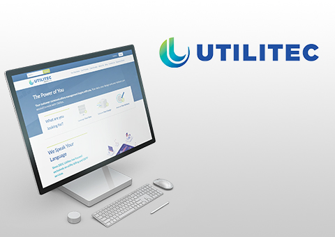
In July of 2019, Utilitec came to Media Genesis (MG) with a request for a full site redesign. The passionate team at Utilitec did not believe the current design of their website best fit their needs and the needs of the individuals and companies they helped on a daily basis. The customer journey was not clearly defined in the layout of the site and client resources were not easy enough to access.
MG’s first task was to analyze the site, its competitors, and its audiences in order to map out solutions for website improvements.
Stage 1: Analysis
Media Genesis started the analysis process by conducting a metrics review and market study, during which time we took a much closer look at the Utilitec site analytics. We used these to help identify in what areas the site was successful and where design and development could help improve status such as visitor retainment.
With the market study, we compared the Utilitec website to its competitors (as well as sites that the Utilitec team liked due to certain visual or functionality elements). From design to navigation to messaging, we analyzed the pros and cons of each of these websites to see where overall improvements could be made to the Utilitec site.
From there, we conducted an Audience, Message, Action (AMA) Workshop. Media Genesis sat down with a diverse assortment of members from the Utilitec team in order to identify the organization’s key audiences, what the messages to those audiences should be on the website, and what actions Utilitec wanted those audiences to take as a result. We were able to use the information garnered here to create designs that were not only visually appealing, but which met the needs of Utilitec as a company and the audiences they service.
Stage 2: Design
Once priorities were established, it was time to begin organizing a new website sitemap in order to improve the user journey and overall information structure of the site. Using the knowledge we had gathered from the metrics reporting and AMA workshop, we worked with the Utilitec team to restructure the navigation in a way that brought Utilitec’s messaging, resources, and services to the forefront.

Upon sitemap approval, MG designers then created three different homepage designs, all using color palettes reflective of the Utilitec logo. From these designs, Utilitec selected their preferred homepage, and MG further adapted the design to fit their needs. We created custom icons for each of the Utilitec services (which can be seen best on the Our Services page). The use of these icons makes it easy to understand each service at a glance, so users can easily identify what they need in less time.
Stage 3: Development
Analysis? Check. Design? Check. It was time to move into the actual development of the website. To start, we verified that Utilitec wanted to remain on the WordPress Content Management System (CMS) platform. Once this was confirmed, our developers began the build, creating the homepage as well as several interior page layouts, which can be seen throughout the site.
The new Utilitec website is clean, easy to navigate, and highly representative of Utilitec’s messaging and the services they provide. Users are now able to find the information they need even faster. It was great working with the Utilitec team on this project, and we’re eager to see where the future takes us.


.png)
