A Flashback to 2010: Website Design Through the Years
As we enter into a new decade, we thought it would be fun to take a peek at popular website trends from the start of 2010 . While 10 years may not seem like an awfully long time, in the world of tech, it might as well be 100 years. From design to development, the industry’s approach to building websites is constantly evolving. Looking back, it can be both useful and amusing to see the progress we’ve made.
Setting the Stage…
2010, it was the year that brought us Adele’s hit song “Rolling in the Deep” and blockbuster hits Inception and Toy Story 3. Simon Cowell left American Idol and formed One Direction on the X-Factor. The Swine Flu pandemic swept the world and Proposition 8 was successfully overturned in California. Kate Middleton and Prince William got engaged. Overall, it was a pretty big year.
Arguably, 2010’s greatest influence on digital media came in the form of an article by web designer Ethan Marcotte on the topic of Responsive Website Design. If you’ve read our blogs in the past, you may know that this is a topic that comes up again and again – and for good reason. In order to make your website as accessible as possible, it needs to be responsive (able to be viewed on laptop, mobile, tablet, etc.), and 2010 introduced this concept into the conversation.
Popular Website Trends
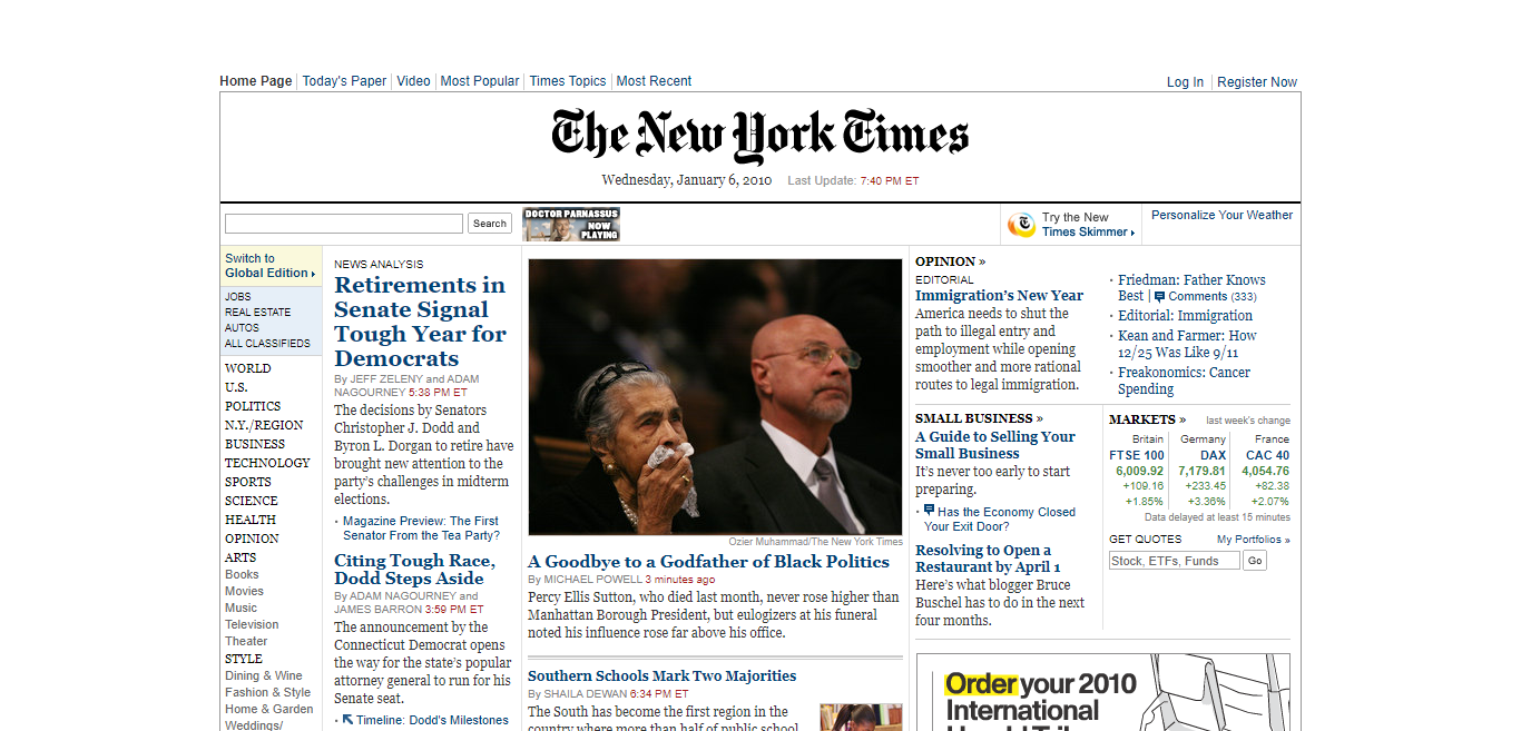
Magazine-style layouts were highly popular, especially for information and text-heavy websites like major publications (e.g. the New York Times) and universities. This style uses columns to separate information across the page. As this trend picked up steam, it was used more frequently throughout a variety of different industries, including business and tech. Even our website at the time adopted this style (we’ve included pics – because it did happen!)
Web designs also began to place a greater emphasis on typography, and this is something that continues to influence the digital industry today. The importance of the legibility (and, therefore, accessibility) of a website became increasingly more important at the start of the decade. And, not only that, custom typography for headers and logos quickly became a must-have.
It’s a Love-Hate Relationship
So, what has stuck around and what did we bid farewell to without a second glance?
It’s Still Around!
- Large Lead Images & Headers: 2010 introduced the “oversized header” – a large image or banner that takes up most of a website’s homepage above-the-fold. Users must scroll down to view additional content. Today, it is common to see various calls-to-action to be included somewhere in this header.
- Fat Footers: The term “fat footer” is used to describe a website footer that contains additional site navigation items. Today, footers often include links to an organization’s social media pages, contact information, and more.
- Infographics: Infographics are all about efficiency, so it’s no wonder these guys are still around. Companies in nearly every industry use these as a tool to communicate ideas through a blended design of images and text.
We Left It in the Dust
- Horizontalism: Just as the name suggests, Horizontalism was the design fad in which websites were built horizontally. Yes, you read that right, a side-to-side scroll. Yikes – it’s no wonder we left this behind and never looked back!
- Keypress Navigation: 2010 was so sure this was the fad that was going to catch on, but this was not the case. Keypress navigation – using keyboard shortcuts to navigate a website – just didn’t seem to improve efficiency enough to get rid of the traditional point-and-click method of website navigation.
- One-Page Layouts: While you still may see this style of website design every now and again, it’s rare, and for good reason. A website made entirely on one page (often resulting in what feels like endless scrolling) is not an efficient design. Navigation exists for a reason. Thankfully, we learned our lesson and moved on.
How Far We’ve Come
After taking a look at where we’ve come from, we’re pleased and surprised at how much the industry has evolved over the last ten years. While some trends have remained strong throughout the decade, we have uncovered far better, more accessible ways to present information to internet users everywhere.
Here’s to another decade of growth and innovation! Cheers, from MediaG.
Curious about how we can help you achieve greatness with your website design? Email us at inquiries@mediaG.com or give us a call at (248) 687-7888.
RESOURCES
https://www.smashingmagazine.com/2010/05/web-design-trends-2010/
https://www.webdesignerdepot.com/2010/05/web-design-trends-for-2010/
https://www.webdesignmuseum.org/web-design-history/timeline-2009-2017

.png)