Part 2: Navigation in 2018, What’s the Right Direction?
In our Part 1 article about navigation last month we talked about homepage navigation, the pros and cons of sticky navigation, and other types of navigation best practices for 2018. And just like any navigation system, there is usually more than one way to arrive at your destination. That’s where interior, meta, and alternative navigation come in.
Types of Interior Navigation
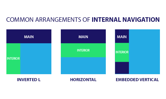
Also called sub-navigation or page-level navigation, interior navigation accesses lower levels of content within the main navigation structure. This type of navigation has content that focuses on a specific section or category. As your organization begins to brainstorm and dive deeper within your website content, or perhaps embarks on a redesign of your website, it is important to keep in mind the users’ journey through your website. Here are three types of interior navigation options:
- Inverted-L – Main navigation is placed along the top of the page and interior navigation is placed as a vertical link list on the left (this is the most common type of interior navigation).
- Horizontal – Interior navigation represented as a second row of options or as dropdown menus under a horizontal main navigation.
- Embedded vertical – Main navigation is presented in a vertical menu on the left or right side and interior navigation is embedded between the main navigation options in a tree-like structure.
Why Is Interior Navigation Important?
It’s easy for users to get “information overload” when it comes to interior navigation. All of the information on your website is important – right? Well, not necessarily. Sometimes, by offering too many options, users get overwhelmed. To prevent information overload, keep your target audiences in mind: what are they searching for, and what is important to them?
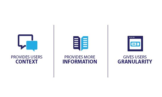
Interior navigation allows you to organize second level content and present it to users in a logical way. Ideally that next level content will be 80% relevant to that target audience. Therefore, it’s a good idea to keep your page-to-page transitions smooth by choosing the right interior navigation.
Here’s how you can accomplish this:
- Have consistent internal navigation across the entire website
- Have distinct separation between Main and Interior navigation
- If an organization’s website is content/section heavy, interior menus can be solely specific to the topic at hand rather than listing all interior navigation
- Create visual cues if there is more information available within the main or interior navigation
Meta Navigation, It’s Not Just an Afterthought
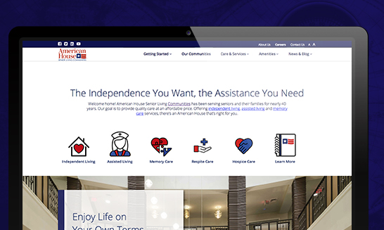
Does your organization use partner sites, third-party sites for careers, account logins, or have an e-commerce store? Meta Navigation can help solve the question: “What do we do with all this extra information?” Instead of placing all this supplemental information into your main navigation, you can link quickly and easily to additional websites or company information using Meta Navigation. Typically, we place this extra-site navigation in the top right corner of the page in plain text above the main navigation. You can also create a Toolbox area, typically seen in websites that are more interactive (i.e. an e-commerce or insurance estimator).
What is Utility Navigation?
Utility navigation connects tools and features that assist visitors in using the site. These pages are typically not part of the main/interior navigation but are placed in logical areas to be easily accessed by the user. Here are some common examples of utility navigation:
Language, Country or Region Selectors:
Has Google Analytics shown you that you have visitors from around the globe? Language selectors enable users to navigate quickly between different languages within the website. In some cases, only specific content may differ based on the country or market for an organization. A country selector allows visitors to pick their market region or location.
Anchor Tagging:
Do you have a lot of content on a page? Anchor tags (or links) help websites with pages that are very long and content heavy. They allow users to jump from one section of a page to another in a more efficient way. Anchor tags are often seen on FAQ pages.
Additional Examples of Utility Navigation:
- Toolboxes: Commonly used to link to functional pages. For instance, linking to a search feature, contact form or eCommerce store.
- Internal Page Navigation: Linking within or around your content is an easy way to encourage users to click around your site more.
- Linked Logos: Allows users to easily access different pages and websites by clicking on a logo.
Want to learn more about this subject? Check out our Part 1 discussion of website navigation and stay tuned for our follow-up Part 3 article next month. If your website needs help with auditing, testing, and developing custom navigation contact our team at 248-687-7888 or inquiry@mediag.com. We can help with recommendations, strategies, and implementation services.


.png)
