Navigation in 2018, What’s the Right Direction?
There was a time, not that long ago, where a road trip meant a fold out map or triptik from AAA. Today, as you get in your car, you now have many different ways to get directions. Websites have undergone a similar change in navigation–there are now many different ways it can be delivered to the user. The device and user mix can significantly change navigation choices in modern websites.
But, when seeking to change your site’s navigation, it’s important to understand its purpose, the general user behavior, and the importance of the navigation’s appearance and positioning in relation to specific pages. This three-part series discusses website navigation trends, best practices, and industry standards for 2018.
Considerations
One approach to navigation is user-centered design, which looks at user behavior to map out navigation. This concept takes into consideration that primary objectives may vary from user to user. For example, one user’s goal when visiting a site is to apply for a job – so easy navigation to the careers page is imperative. Another visitor might be looking for history of the organization – requiring that information to also be found easily. Navigation, therefore, should always focus on the majority or targeted users while taking into account how other users may behave / navigate. In addition to user-centered design, site navigation development can also be derived from analytics. If an organization’s central focus is to drive traffic to a page not commonly visited, navigation may be adjusted accordingly to increase user views.

Distinguishing Navigation
Navigation comes in all types, shapes, sizes and locations. So where do you begin when deciding how your navigation should be structured?
A good place to start is with using the following framework to identify the behaviors of navigation:
- Type of content
- Link behavior
- Navigation Purpose
- Navigation Appearance
- Navigation Position
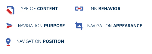
Each of these five factors play a significant role in deciding the type of navigation and where it should be placed to maximize user experience. Navigation should provide a clear path for any user to maneuver through.
While thinking about each of these factors, it’s important to think from a user’s perspective. Investors, for example, are a common audience for publicly traded companies. There will be many common, and possibly unique, audiences for each company. As such, think of an audience and jot down the top 5 most important things investors need to know about your business or information they may seek. Once you have your list, think about whether or not your current website makes it easy to find those items. If it doesn’t, it might be time to rethink and reimagine your navigation. Data and analytics can also help validate real life examples whether that content is being found and how users got to it.
It All Starts With the Homepage
Imagine you are in New York and you pass a news stand. The Post has one of their classic, eye catching, headlines and you decide you have to read the article. You pay the vendor, pick up the paper and walk down Houston Street as you read. The article sucks you in, and as you get to the bottom of the column of text, you realize you are going to have to open to another page to read the rest of the article. This is no big deal, it is an interesting article. You position your hands on the paper so you can quickly open it, but then, imagine if there was no text directing you to the rest of the article. You’d flip through the pages trying to find it, but growing quickly frustrated, you’d toss it in the trash and continue on your way. The navigation on your homepage serves the same purpose as those “article continues on page 9” captions in the paper. Because of this, it is wise to have wayfinding be the main focus of your navigation.
The main navigation represents the top-level pages of a website’s structure. Typically, links in the main navigation allow users to get to pages within the site. It also gives organization that creates a consistent expectation for the user. This is especially beneficial for large, information-rich sites.
One of the most common types of navigation are drop-down menus. Drop down menus can be difficult for search engines to crawl, depending on how they’re implemented. Nielson Norman Group conducted a study that drop-down menus can be annoying because visitors move their eyes much faster than they move their mouse. However, recently, a new drop-down navigation technique has been used; it is called the mega menu. These display all of the menu options for a particular drop-down in one large menu instead of a narrow, single level drop-down. Mega menus allow users to view much more information at a quick glance than a traditional menu system.

Is Sticky Navigation Here to Stay?
Sticky navigation, also called a fixed header, is navigation that fixes the menu to the top of the page and stays there as the users scrolls the page. This is a fairly common navigation type, but what are the pros and cons of using this type of navigation?
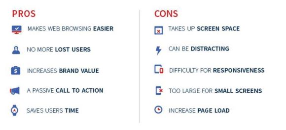
Pros:
- Makes web browsing easier – menu options at your fingertips is a plus for users
- No more lost users – ensures users don’t get too lost within a website
- Increases brand value – keeps the logo front and center at all times
- Passive call to action – keeping it always visible and available to users
- Saves users time – users can easily jump to another section
Cons:
- Takes up screen space – uses valuable screen, design and content space
- Distracting – may be distracting for some users
- Difficult for responsiveness – may be difficult to develop for various mobile devices
- Too large for small screens – can disrupt the user flow while navigating
- Increases page load – complex development, which may increase page load time
When does sticky navigation make sense? It is generally recommended on eCommerce, financial or other action oriented sites. Websites with much information, such as forums will use sticky navigation to limit unnecessary scrolling. However, sticky navigation isn’t for everyone. Websites with limited information, direct call-to-actions, or specifically targeting mobile users should consider a different form of navigation.
How Should Modern Navigation Be Formatted?
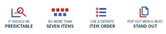
Have you ever gotten to a website but just left when you couldn’t find the answer you needed quickly enough? Thinking about your primary and secondary audiences’ interests and needs while making main navigation decisions will ensure your website will be user-friendly and easily navigable. We recommend you keep the following things in mind:
- The navigation should be predictable, accessible, and easily visible on all devices. Best practice is no more than seven main navigation menu items. This will improve the user’s experience and prevent information overload.
- Navigation is about hierarchy (order or importance) and organization. When determining your navigation items, it is important think about the structure and identify user behavior by reviewing your websites analytic metrics.
- Give your navigation items user-friendly names. Again, consult your website’s analytic metrics and ask yourself who is the end user on your website: are they the general public or businesses within your industry? Using the correct terminology in your navigation items shouldn’t be overlooked.
- The last important focus should be on styling. Menus should be prominently designed and stand out from the rest of the content. Useful practices include shadows, color, contrast, and fades. The menu treatments mentioned are all effective. however, they may not need to be employed together, or at all. Another note for menu styling is the typography. Typographical hierarchy and transparent call to actions are important so the design and language both grab the user’s attention. Remember to stay within your brand guidelines.
Stay tuned for our part two and three articles where we will discuss types of interior navigation, meta navigation, footer navigation, alternative navigation, and more! If your website users are getting lost within your site give our team a call at 248-687-7888 or email us at inquiry@mediag.com. We can help with recommendations, strategies and implementation services for all things web.

.png)