Web Accessibility and Making Your Website Disability-Friendly
Navigating the web can often be frustrating for even the savviest of users. Imagine trying to do so with impaired hearing, sight, or another disability. Seems difficult, right? Every day, inaccessible web design prevents people in the disabled community from having an easy experience.

With nearly 1 billion people around the world living with a disability, it’s important to recognize that people with disabilities use and view websites differently. Different disabilities can offer unique challenges for web design. Fortunately, there are many techniques and tools to help you create a robust website that also addresses the needs of many of your users. In fact, building a disability-friendly website is easier than you might think.
Visual Impairments
Some internet users are visually impaired and have difficulty seeing or can’t see at all. To navigate the internet, they often use a screen reader tool, a software program that reads text on a screen aloud to the user. In order to ensure that they can engage with images and other graphics on your website, you can apply alt-tags (alternative attributes) to every image. These descriptors allow screen readers to properly communicate what the image is.
Similarly, all uploaded documents to your website should be available in a text format, not just a PDF or other image-based format that can’t be understood by screen reading tools.
Another good tip to help make your website easier to use for those with a visual impairment is to use periods in between each letter of an abbreviation. Screen readers often won’t recognize abbreviations without periods so they’ll try to read it phonetically.
Be conscious of colors when designing your website. Nearly 1 in every 12 men experience color blindness. To relieve some of the eye strain your readers may encounter, focus on web designs that embrace contrast and help the text pop. Layering colors from a similar palette, such as using light blue text on a medium blue background, can be challenging to decipher. You should also be wary of using yellow, blue, and green close to one another. Think you see color perfectly? Take the online color challenge to find out.

Your readers will thank you for clear headers with large and simple text throughout your website. Ensure that your text can resize up to 200% without losing information.
Lastly, make sure that any colorful graphs, charts, and infographics also display numbers and values so that users can process the information more easily.
Hearing Impairments
Not all internet users have the ability to hear audio clips without difficulty. When uploading custom videos to your website, be sure to always include subtitles. This ensures equal and enjoyable access to the multimedia content on your website.
Navigation Difficulties
Using a mouse and pointing accurately is a challenge for some users and so they rely heavily on keyboards. Program your website functionality so that all content can be accessed via keyboard, not just a mouse.
It is also important to ensure that there are at least three different ways a user can access information. The most common three are through the search bar, primary navigation, and footer navigation.
Overstimulation
When laying out your website, be considerate of how the graphics and text interact to reach the viewer. Flashy and energetic graphics can distract and potentially over-stimulate the user. This is especially true for people with Attention Deficit Hyperactive Disorder, Autism, and those susceptible to seizures. To reduce the likelihood of over-stimulation, consider the balance of text, graphics, and animations on your webpage and include a clear method for users to hide animations.
General Tips
In order to get your message across, your website needs to be as clear and as specific as possible. Be descriptive when embedding links. Rather than writing “click here for the form,” try “This form will help you complete the application.” Your links should always make contextual sense when viewed on their own and should be underlined and in another color to be easily identifiable.
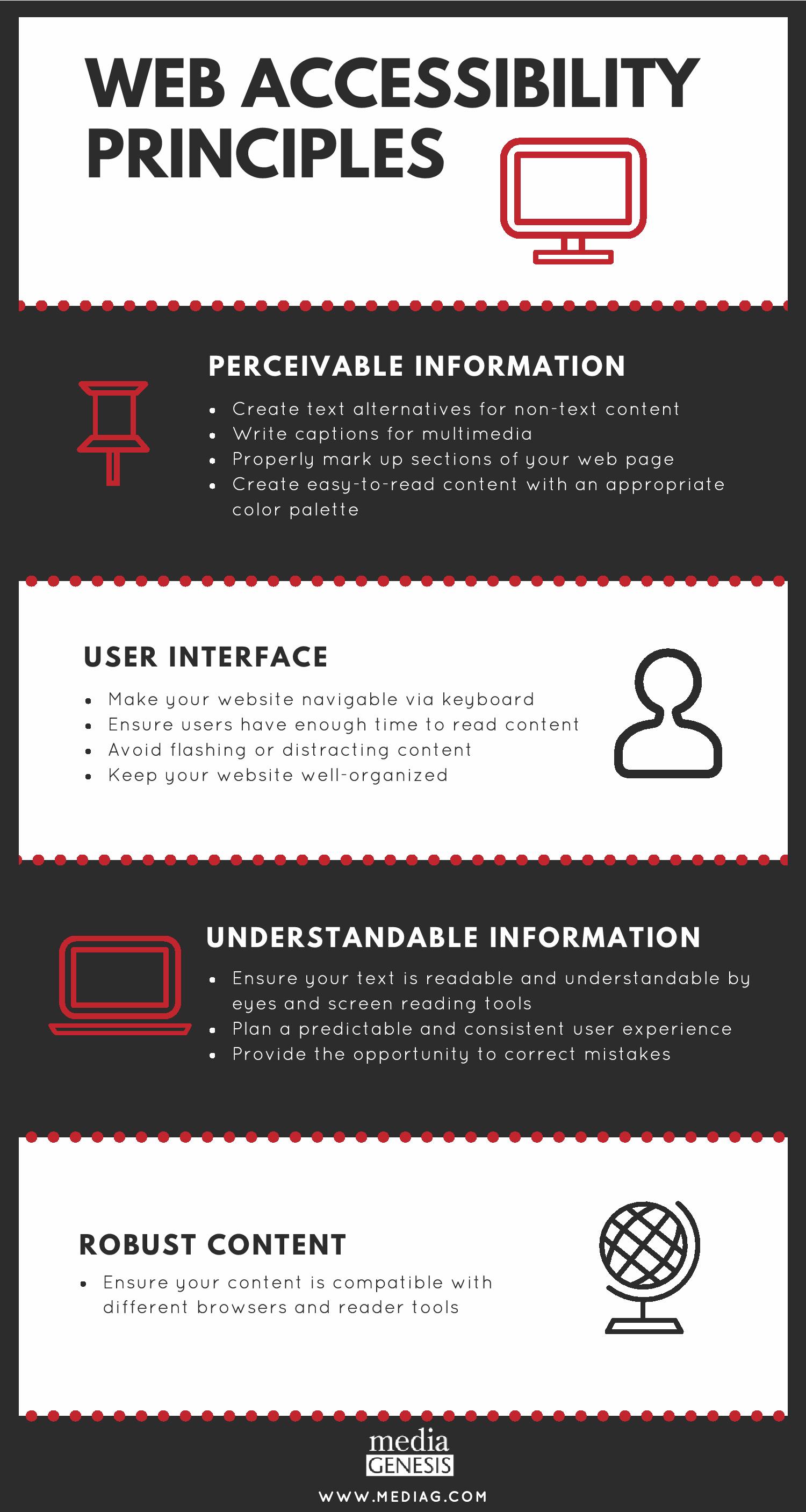
Below are some general principles to follow when designing your website, as outlined by the Web Accessibility Initiative.
Download Web Accessibility Principles

The above guidelines are a great place to start for making an accessible website but do not guarantee that your website will be compliant with Section 508, the U.S. law pertaining to electronic and information technology standards.
Do you need help making your website more user-friendly for people with disabilities? We’re fully qualified to pinpoint your audience, determine their unique web needs, and establish a set of principles to abide by throughout the design and development of your site! Contact us today to learn more!


.png)
