Top Web Design Trends of 2017
The world of digital design is ever-changing. From bold neon colors and large text to animations zipping across the screen, businesses and web designers are always looking for the next big thing they can use to catch (and keep) the eye of website users.
As we dive into June, we’ve been paying attention to 2017’s most inspiring web design trends. These are here to stay:
Minimalism
White space, white space, white space! Having a simple and clean website with tactful white or negative space helps put the focus on your content. Littering a website with lots of visual elements and information can confuse users as they won’t know what to pay attention to, increasing your bounce rates and decreasing your conversions.
However, it is important not to remove necessary website elements such as navigation on the footer just for the sake of increasing the negative space on the page.
Microinteractions
Like normal human interactions, a microinteraction is the response you make when doing an activity or action. Microinteractions are minor visual cues on a website. They can be an animation or simply a CSS transition i.e. when an arrow pops up after you hover over a button. These interactions give users a sense of control and allow them to see their action has a reaction.
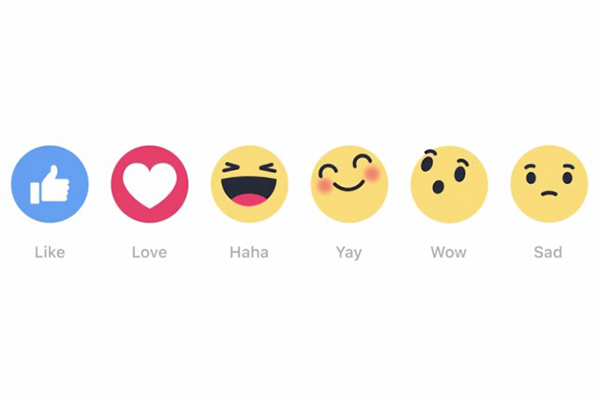
Another example of this would be Facebook’s new reaction emojis. Users now have the ability to more appropriately express what they’re feeling when they read a sad post or watch a funny video.

Bold and catchy typography
2016 introduced new and universal typefaces, and this year designers will continue to evolve it by experimenting with bold typography. The goal of this practice is to swiftly guide the user and catch their attention about an individual or business core message.
Grid based layouts
With many websites on the internet, designers and developers need to be more functional and balanced. And also create a feeling of uniqueness.
Custom grid layouts allow designs to be versatile and modern, while still keeping everything on the page balanced and responsive-friendly.
More SVGs
Scalable vector graphics, or SVGs, allow designers and developers more flexibility than the traditional image formats like JPG, PNG, and GIF.
SVGs are composed of vectors: mathematical descriptions of the object’s shape. This is important for design because these SVG images will resize and display properly on any screen and any device.
SVGs are also good because they help increase page speed as they don’t require constant HTTP requests, which can slow down a website.
Video and animation

Video tutorials and visual presentations have become huge assets for individuals and companies promoting their products or services. Users can see videos via YouTube, websites, social media, and other marketing channels which easily explain a brand’s benefits and special offers. Thus increasing engagement and connection with audiences.
Animation also helps users know what they should pay attention to. Animations enhance the storytelling element of a product and better demonstrate how it would work. They’re also more engaging and easy to understand than a long page of text.
AI-powered bots and conversational interfaces
Though not a new technique, chatbots are making strides in helping businesses communicate directly with their customers. They also streamline the sales process so that websites keep performing round the clock.

With any design trend, the goal is to create a better user experience. A personalized, immersive website that uses bold, visually stimulating design layouts and interactive UI elements connects the audience to the business on a more personal level and ultimately, help drive profits.
Know of any other design trends? Share them with us on Facebook!


.png)
