Website Testing – Which Browsers Matter?
One of the challenges with web-based development is that the delivery mediums are developed by many and are constantly changing. These mediums typically come in the form of desktops, laptops, tablets, and smartphones. This not only makes development a challenge (as a website should have a responsive design), but also testing across the many browsers, versions and devices. This article will help you determine what to test, why, and some tips for making the most of your testing.
Few of us have unlimited budgets and time, so we need to make smart decisions when it comes to our testing. When trying to decide which browsers you should test your site on to get the most bang for your buck, you should consider several factors:
- Device type
- Browser usage
- Your own website analytics
For these stats, I’m focusing on the U.S. region, but this reference site is also helpful to see worldwide stats. You can also slice and dice the data many different ways.
Device Type
Let’s start by considering the breakdown of Desktop vs. Mobile vs. Tablet.
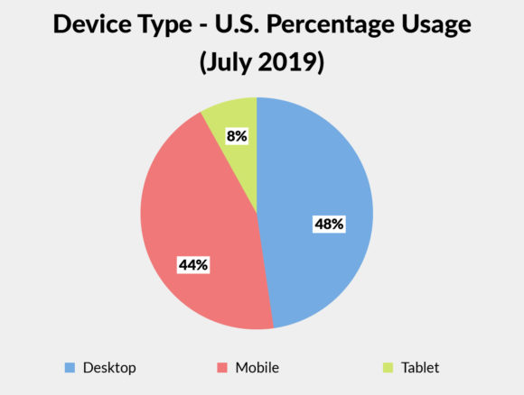
Globally, mobile (smartphone) viewing of web content is greater than 50% and has surpassed desktop viewing. However, in the U.S., desktop viewing is around 48% and mobile is around 44%, which is still significant. Tablet web viewing has been flat for the past year at around 8%. Now, it has become just as important to test on mobile as it is on desktop.
Browser Usage
Next up, we need to know which are the most used browsers today and how many of those we should prioritize when testing.
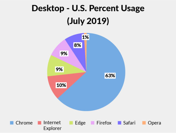
The dominant browser for desktop is Chrome with over 60% usage, followed by Internet Explorer (IE) at 10%, and then Edge/Firefox/Safari all in the 8.5% – 9% range.
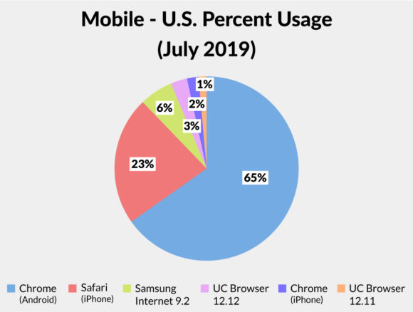
For mobile, almost 90% of the browser market is captured by Chrome and Safari.
Your Own Website Analytics
While these stats above cover the broader U.S.-based population, it is very important for you to look at your own website analytics (i.e. Google Analytics) to see if your website visitors have any unique browser usage that should impact your testing. Some companies may have a designated browser for internal use (i.e. Internet Explorer – sorry ☹) so your testing plans may need to be adjusted to meet those needs.
Browser Testing
Armed with all of this data, now we need to decide which browsers/versions to test. Chrome is a no-brainer as the world’s most-used web browser (growing rapidly since its launch in 2008), but how should you divide your time between the others?
Based on desktop usage in the U.S., IE is the next highest at 10%. However, IE requires special consideration and I’ll discuss that more in the next section.
Edge and Firefox, coming in at 9% each, seem to follow the same general trends as Chrome in terms of how they handle the ‘newer web standards’ and should be included in your testing. As a result, it is likely that if a website works in Chrome, it should work in Edge and Firefox as well.
Internet Explorer – Just Say No
With the launch of Microsoft’s newest browser, Edge, in 2015, Internet Explorer has been – for all intents and purposes – left in the dust.
According to Microsoft:
“Internet Explorer 11 is the last major version of Internet Explorer. Internet Explorer 11 will continue receiving security updates and technical support for the lifecycle of the version of Windows on which it is installed…Microsoft recommends using Microsoft Edge as your default browser and supports Internet Explorer 11 for backward compatibility.”
Also from Microsoft in Q1 2019:
“… Internet Explorer is a compatibility solution. We’re not supporting new web standards for it and, while many sites work fine, developers by and large just aren’t testing for Internet Explorer these days. They’re testing on modern browsers.”
So, considering Microsoft’s stance on its own IE browser, it is not a prioritized browser for Media Genesis to use for testing.
Media Genesis Minimum Browser Testing Standards
Now you have a better feel for which browsers need testing. For Media Genesis projects, we use a minimum standard for our testing which includes:
- The two most recent browser versions of Google Chrome and Mozilla Firefox, and the latest version of Microsoft Edge
- The latest mobile versions of the Apple iPhone/iPad (Safari and Chrome) and the latest version of Android (AOSP running Google Chrome)
Beyond these standards, client/project-specific needs will determine the breadth and depth of our testing.
Testing Tips and Suggestions
You now know which browsers Media Genesis prioritizes to test, so let me share some testing tips and suggestions. With over 34 years of doing software development testing, here are some foundational principles I like to follow:
- Cross department testing. Make sure any departments (i.e. Design, Programming, Project Management, Quality Assurance) that touch a project assist with testing. The more levels in the organization, the better chance to catch typos, layout, or functional issues.
- New Users. Those closest to the project should definitely test as they know the ins and outs of the site, but make sure to have others test that are not familiar with the project as they will tend to click things or enter form data that you may not expect.
- Expected Data. Make sure to enter real test data in forms. Just entering “Test” in each field is not acceptable. It’s good to test with the data you expect to be input in those fields (i.e. names, addresses, etc.) so you can also see how it will be output in a database, email, or graphical interface.
- Unexpected Data. Also make sure to use bad or unexpected data. Test the limits of fields, enter symbols, don’t follow the expected path/flow, and see how error checking handles those.
- Functional Requirements. Make sure the site/system meets all of the requirements that were originally mapped out and have examples to test different user levels/permissions and all functions specific to those users (these are called “use case” examples).
- Cross-browser Testing. You need to test your site across multiple browsers. For you to test everything in every other browser/version/device probably isn’t realistic, so make sure you do a thorough test in one browser (maybe Chrome since it’s the most used) and then, at a minimum, do spot testing in others.
- Mobile Testing. You do need to make sure you do a thorough mobile test to confirm content is wrapping as expected and functionality is working on mobile devices. Certain features like “hover” that works on Desktop will need to work differently on mobile, so keep that in mind as far as your users’ experience.
- Repeat Testing. When you do testing and find issues, make the changes/fixes you need to make and then retest. If you only do a minimal spot retest you could miss an issue your change caused in a different area, so depending on the complexity of your site/system, you may need a more thorough retest for any changes you make.
For software development and website testing, you need to make sure you allocate plenty of time during and at the end of the project. Also, remember when you transition your site from Development to Staging to Production, you will need to retest. There will be typos, errors, and issues in your code. It’s your job to catch them before others do.

.png)