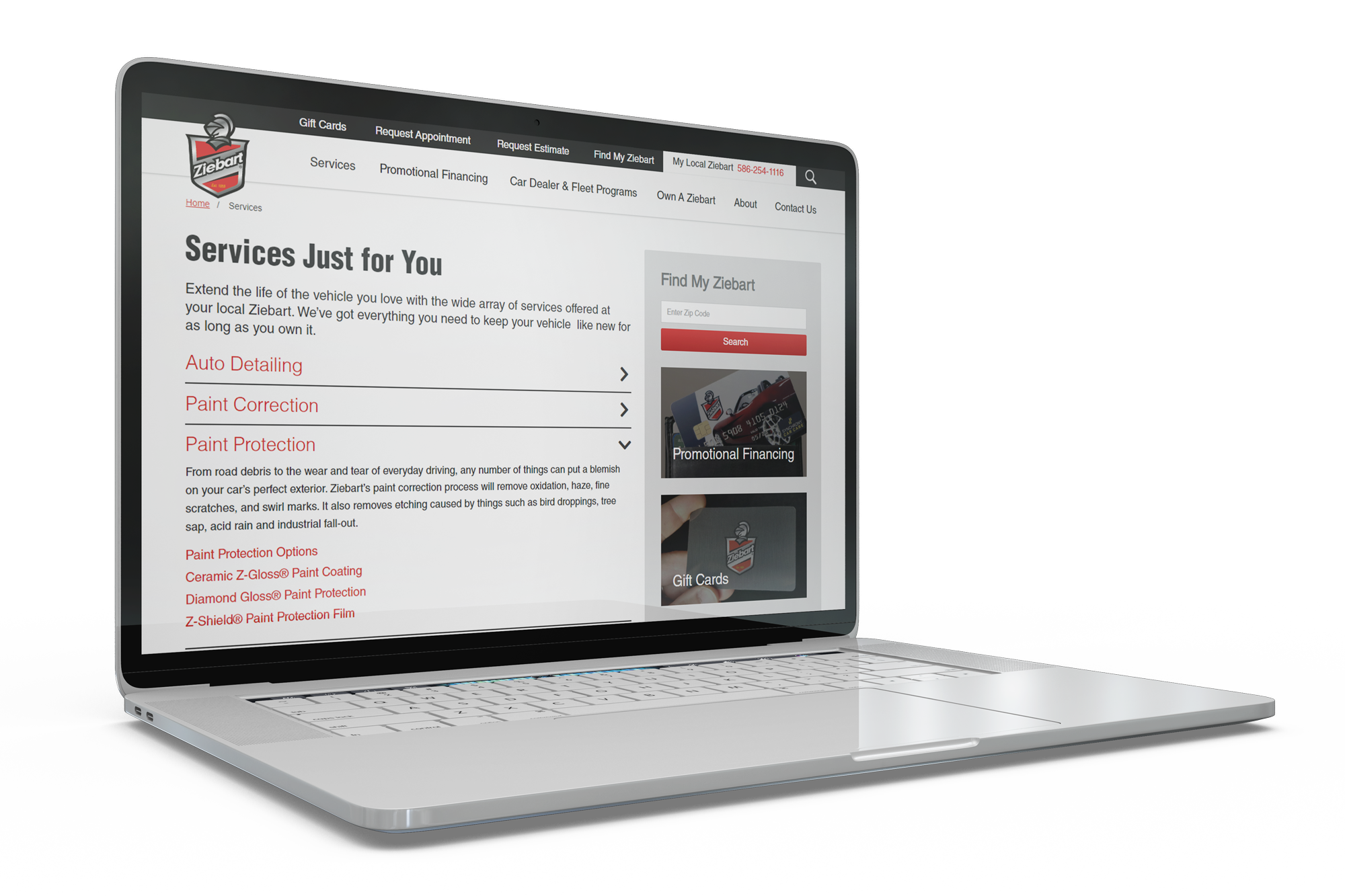
Ziebart: Website Design and Development
Media Genesis partnered with Ziebart International Corporation, a company specializing in vehicle appearance and protection services for over 60 years, to design and build two new websites for Ziebart’s Retail and Franchise enterprises. While both projects took place simultaneously, this article will focus specifically on our work with the Ziebart Retail website.
This project was broken down into three phases: Analysis, Design, and Development. In each of these phases, we identified Ziebart’s most pressing needs and focused on addressing them. The result is a website that not only represents the diverse services Ziebart offers, but also speaks to the interests of their customers.
Phase 1: Analysis
The analysis phase began by pulling data to create a metrics report, which displayed a vast assortment of statistics such as monthly users, page views, mobile vs. desktop usage, traffic channels, and more. This information was then used to develop a benchmark and market study report. This study also included a number of Media Genesis recommendations, which acted as a foundation for the design and development phases which took place later.
Media Genesis then hosted an Audience, Message, Action workshop (more commonly referred to as an AMA) for a large group of key stakeholders from Ziebart. This is a workshop that was developed at Media Genesis in order to help identify a website’s unique audiences, what messages should be provided to these audiences, and what actions the client wants these audiences to take.
For Ziebart, who has been in business for over 60 years, this was an important step. There was a need to ensure the new website didn’t just look updated, but also spoke to the key Ziebart audiences and their changing needs.
Main audiences were established during this meeting, website goals were created, and insights documented. Like the benchmark, these results were used as reference points to develop the ideal Ziebart website.
Once this initial round of analysis was complete, we began to document functionality needs based on our findings and Ziebart’s wish list. From there, we worked with Ziebart to develop a plan that addressed the full scope of the website’s functionality needs.
The final piece of the analysis phase was the creation of a sitemap in order to neatly lay out the information architecture of the website. This new sitemap offered a better user experience and improved keyword usage based on Search Engine Optimization (SEO) and best practices. This allowed us to better organize the way in which Ziebart’s services are presented, which makes up a very large portion of the overall site.
Phase 2: Design
After initial analysis was complete, we were ready to move into design. With a new homepage layout, usability testing took place in the form of a survey, which compared Ziebart’s original homepage design to the new design created by Media Genesis. Audiences were asked questions such as “Is the website’s information readily available?” and “Did you learn more about the Ziebart brand?” This was done in order to garner feedback regarding the design changes and to better understand the site’s usability from the perspective of actual users.
The results of the usability testing were shared with Ziebart, and then interior page design began. Media Genesis created custom page templates within the Sitefinity CMS, working with the creative team at Ziebart in order to conceptualize what each of these pages should look like and how they should function to best benefit the website and brand.
Media Genesis redesigned customizable store pages for a more user-friendly experience, incorporating social links and a custom photo gallery section for each location. We wanted to create a design that Ziebart would be able to grow into, and these custom pages allow for that.
In order for a user to locate their nearest Ziebart location, Media Genesis improved the search functionality within Sitefinity and made back-end updates for a more seamless experience. Clear calls-to-action (CTAs) located throughout the website will bring users to this page. Results are laid out in a clear grid with limited whitespace – making it easier to separate one store location from the next.
Custom CTA blocks were also added to the right-side column of most pages, prompting users to learn more about services, find their local Ziebart, sign up for Ziebart’s blog, follow Ziebart on social media, and more.

Phase 2.5: Content Writing
In addition to traditional website design and development tasks, Media Genesis was asked to help with content creation and editing. We reviewed and edited content in order to create consistency in voice, tone, and messaging throughout the whole of the Ziebart website.
In collaboration with the Ziebart team, several rounds of revisions were done in order to finalize language and properly capture the Ziebart voice.
In addition to writing content, we also wrote SEO metadata (titles and descriptions); these are tools used by search engines to understand the content on each page of a website. By including strong SEO, website pages will rank higher on search engines when a user types in a related query.
Phase 3: Development
Alongside page design, Media Genesis implemented a new URL structure within the Sitefinity database to help clean up and organize URLs throughout the site, making them more search-engine-friendly. As a result, a majority of the URLs on the website are new.
Due to these URL changes, our developers had to implement redirects and Do Not Index (DNI) orders across the site to ensure that search engines could still find the Ziebart website and it would not lose search engine ranking. Hundreds of website links were analyzed, which Media Genesis developers then cross-referenced by status code (e.g. 200, 300, 400, 500) and manually organized with the new URLs.
Media Genesis then upgraded Ziebart’s Sitefinity Content Management System (CMS), making it more up-to-date and secure.
Media Genesis was asked to perform a separate audit of the hosting and server environments to prevent any slow load times both in the new and existing websites. We diagnosed the issues that were affecting the speed and load time, and made server update recommendations for the new website.
As developers built and implemented page structure and design, the MG team populated the entire website: all 30+ service pages, individual store location pages, store details pages, and all new photo assets. The website redesign was also an opportunity for the Ziebart Creative Team to update photos and videos throughout the site. The Ziebart Creative Team did a complete overhaul of all assets and provided MG with a spreadsheet mapping where the new assets could be downloaded and updated on the new website.
The Next Phase
We can’t wait for you to explore this exciting new launch and we look forward to our continued partnership with Ziebart.
Looking back on the success of this project, we are even more excited to discover what the future holds for Ziebart International Corporation and Media Genesis. We look forward to making even greater strides to improve user experience and make the Ziebart websites the best they can possibly be.


.png)
