Better Brands Build Brand Guides
If clothes make the person, then brand identity makes the company. Brand identity tells your customers who you are and what you are about. Take the Walt Disney logo as an example. The big swooping “W” and the curvy fun “D” create a sense of warmth and friendliness, the values the Disney Corporation wants to embody. The interesting thing about the logo is, contrary to popular belief, it is not Walt Disney’s signature. Rather it is a stylized version that better represents the company’s values.
![]()
But a logo alone does not create a brand’s identity. To make sure that your brand is consistently delivering your brand values, you need to develop Brand Guidelines.
There are many different elements you need to consider when creating your brand guidelines. In the sections below, we will look at three of the most important areas to cover.
Logo Usage
Your logo acts as the instant identifier to your business. A logo can include the company name, like the Disney logo, or it can just be an image. For example, if you see a silhouette of an apple with a bite out of it, you know exactly what company it is, that’s known as brand recognition. However, just having an eye-catching design is not enough. Included in the logo section of your brand guidelines needs to be specifications about logo spacing, placement, colors, and of course, misuses.
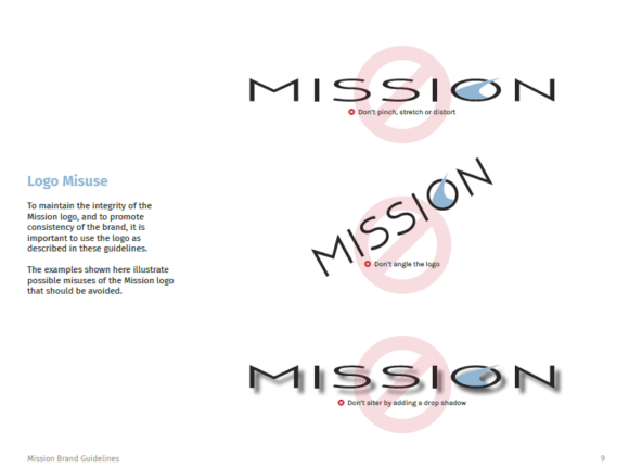
Misuses are important because consistency is everything. Just imagine you went to an independent computer store to buy a new Mac. If the apple was facing the wrong way (the bite in the apple was on the left instead of the right) you would instinctively feel something was amiss. Maybe the Mac you are buying is a fake, or maybe the factory made a mistake, but either way you would have a sense this machine wasn’t an original. That feeling didn’t happen by accident; it occurs because Apple has placed the bite on the right side since 1977.
Typography
Typography oftentimes gets glossed over, but it is just as important as your logo. The alphabet has been referred to as the first form of abstract art, and because it is a mark that conveys some sort of information, the shape of the mark influences the tone of that information.
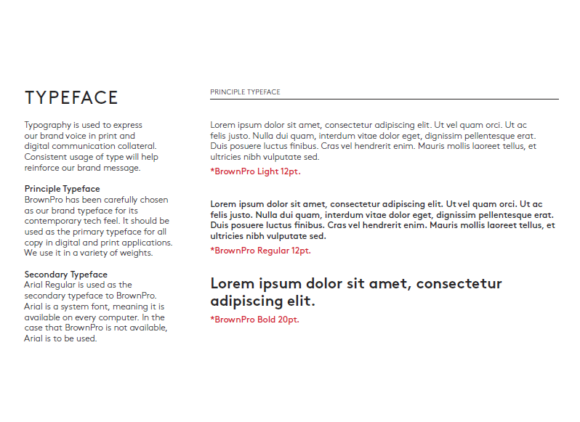
You should choose a font family that represents your brand values. Imagine if a skateboard company used the same font as the New York Times; you would think of them as out of touch with their demographic.
Color Palette
As far back as the ancient Greeks, artists have studied color theory. As this field has grown and advanced, it has moved beyond just understanding how to mix colors and focused on the effects that colors have on our moods.
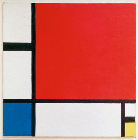
Artist Piet Mondriaan famously used color theory to convey different emotions in his viewers
The colors selected for your brand need to represent your brand values. If you run an industrial nightclub, picking bright colors won’t help your audience understand what your club is like.
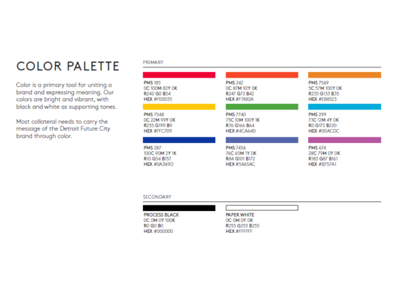
When you select your color palette, you should always include details for RGB and CMYK versions of each color. This will ensure that the colors appear the same whether your designers are working on a piece of print or digital media.
There is more…
Logo, typography, and color palette is just the start of the essentials. To fully maximize your brand standards, your brand guidelines should also include everything for the types of images associated with your marketing material, from business cards and letterhead, even to your email signature. A complete brand guide should function as a holy text for your company, offering rules for all aspects of your presentation to the outside world. They should never be deviated from, just like the red used by Coca-Cola is always the same red, no matter what.
Are you interested in developing a brand guide for your company, but aren’t sure where to start? Reach out to our team at inquiry@mediag.com or by calling 248-687-7888, our staff of graphic designers, developers and marketing professionals can help!

.png)