Design Choices That Are Quietly Hurting Your Website
How common visual decisions damage accessibility, SEO, and the trust of the people you are trying to reach.
By Media Genesis
Picture a website with your brand colors splashed across every element. The logo, the buttons, the background, the text. It looks cohesive on a brand deck. On a screen in the real world, with a real person trying to read it, there is a decent chance some of that text is invisible to them.
According to WebAIM’s 2025 analysis of one million home pages, low-contrast text is the single most common accessibility failure on the web. It appeared on 79.1% of the pages tested. That is not a fringe problem. That is the web’s most repeated mistake, and it traces back almost entirely to design choices made without accessibility in mind.
Accessibility and SEO are often treated as separate conversations. They are not. Both depend on the same fundamentals: structure, clarity, and content that works for every person who encounters it. When design choices break those fundamentals, the site fails on both counts at once. Here is where most sites go wrong, and what to do about it.
Color on Color: The Most Overlooked Visibility Problem
Color contrast refers to the difference in luminance between text and the background behind it. WCAG 2 (the Web Content Accessibility Guidelines, the global benchmark for web accessibility) sets a minimum ratio of 4.5:1 for normal body text against its background to meet Level AA compliance. Large text gets a slightly looser standard at 3:1. Most organizations set AA as their target. Very few websites actually hit it.
The brand color problem shows up here constantly. A company picks two or three core colors during a rebrand and asks their web team to build the site around them. Those colors look great in print. But brand palettes are built for aesthetics, not screens. A medium blue on a slightly lighter blue might feel consistent on a business card. Put those two blues next to each other as text on a webpage and you have created a barrier for anyone with low vision, color blindness, or even someone checking their phone in bright sunlight.
The fix is not to abandon brand colors. It is to treat them as a starting point, not the final word. Most brand palettes need to be extended with accessible variants: a darkened version of a primary color for text, a lightened version for large backgrounds. The visual identity stays intact. The content becomes readable. A free tool like WebAIM’s Contrast Checker takes about ten seconds to confirm whether a combination passes before it ever goes live.
One pattern worth calling out specifically: dark text on a dark background and light text on a light background. Both feel intentional in early design mockups because designers often view those files on high-end calibrated monitors. On a standard laptop screen or a phone in daylight, that contrast dissolves. What reads as subtle elegance in Figma becomes unreadable in a browser.
Typography and Fonts: Small Decisions With Big Consequences
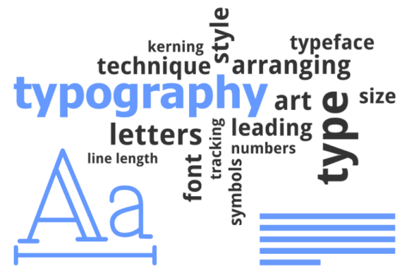
Typography choices affect how long someone stays on a page and how well they absorb what is there. The baseline standard for body text is a minimum of 16 pixels — smaller than that and users are forced to zoom in, which disrupts the layout on most sites and sends people elsewhere. Sans-serif fonts like Inter, Roboto, or Open Sans are the standard for digital readability; highly decorative fonts, thin scripts, and all-caps body text reduce comprehension for most readers and are particularly difficult for those with low vision.
Line height and line length are the quiet ones. Setting line spacing to at least 1.5 times the font size gives text room to breathe. Cramped lines are harder to track, especially on mobile. For line length, 50 to 75 characters per line is the readable range for body text. Pair tight line height with long lines and you lose people mid-paragraph. These are not aesthetic preferences. They are functional standards that directly affect how much of your content readers actually process.
H1s and H2s: Structure Is Not Just About Looks
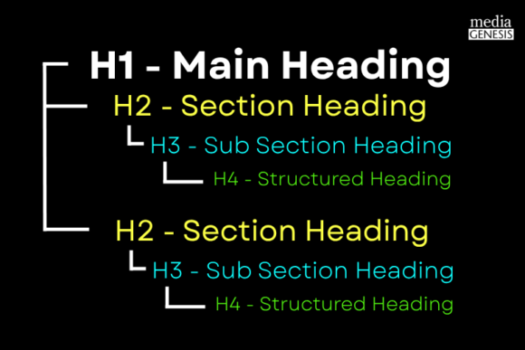
Headings are the skeleton of a web page. They tell Google what a page is about. They tell screen readers how the content is organized. They tell a person scanning the page where to jump in. When headings are used decoratively rather than structurally, every one of those functions breaks down.
The H1 is the most important. One per page. It should contain the primary keyword the page is trying to rank for, written as a clear and specific description of what the page covers. Best practice keeps it under 60 characters. The H1 should also be the largest visible heading on the page, typically 32 pixels or larger, reinforcing to both users and crawlers that this is the top of the hierarchy.
H2s divide the page into major sections. They should describe the section they introduce, not tease it with cleverness. A heading that reads “The Secret Sauce” tells Google nothing and tells the reader even less. A heading that reads “How We Approach Client Onboarding” tells both exactly what follows.
The mistake that damages SEO and accessibility simultaneously is skipping heading levels. Jumping from an H1 directly to an H3 because the H3 font size looked better in the design breaks the document outline. Screen readers navigate by heading structure. Google’s crawlers use heading hierarchy to understand content relationships. A visually polished page with a broken heading order is still a broken page.
Branding Color Palettes: What to Include Beyond the Core Two or Three
Most brands define two or three primary colors. That is the right number for identity. It is not enough for a functional website. A site needs text colors, background colors, interactive state colors (hover, focus, active), error and success states, and neutral tones for structure. Brand palettes built purely around visual identity often lack a true dark tone that reads well as body text and a true light neutral that works as a large-area background. Those two additions alone solve most contrast failures without touching the core brand identity.
Color should also never be the only way information is communicated. A red error message that relies entirely on color to convey urgency fails for color-blind users. Add an icon. Add the word “Error.” The WCAG standard is direct: color alone must not be used to convey meaning. This applies to status indicators, form validation, charts, and navigation cues.
Paragraph Length for CTAs: Less Is Necessary
A call to action asks someone to do something. Fill out a form. Book a demo. Download a guide. The copy leading into a CTA has one job: remove hesitation without adding confusion. Long paragraphs before a CTA do the opposite.
For CTA-heavy sections, two to three sentences is the target. Enough to answer the relevant question in the reader’s head, not enough to bury the button. Text that runs longer than that before a CTA typically contains information that belongs elsewhere on the page, or does not belong at all. Cut it. Move it. The button performs better when the reader arrives at it without having to process a paragraph first.
This also matters for mobile. On a phone screen, a dense block of text before a CTA can push the button below the visible area. Someone who was ready to click has now had to scroll. Some percentage of them will not bother. Paragraph length is a conversion issue as much as a readability one.
Spelling, Grammar, and Syntax: The Trust Problem Google Cannot Ignore
Google has stated that spelling and grammar are not direct ranking factors. That is technically true. It is also not the full picture. Poor writing has real, measurable downstream effects on the things that are ranking factors.
When a page has consistent spelling errors or grammatical problems, users leave faster. Bounce rate goes up. Time on page goes down. Neither of those helps a site rank. Pages with errors also attract fewer backlinks. Other sites are not going to reference content that looks unreliable. Backlinks remain one of the strongest ranking signals Google uses. Content quality is upstream of all of it.
There is a practical authority dimension here too. Google’s quality evaluation framework centers on Experience, Expertise, Authoritativeness, and Trust (E-E-A-T). A page riddled with basic errors undercuts every one of those signals. The content may be accurate and original, but errors tell both the reader and the algorithm something different. Bing is more direct: spelling and grammar quality factor into their ranking signals explicitly.
Syntax problems are worth separating out. These are sentences that are grammatically incomplete, ambiguously structured, or constructed in ways that confuse the reader even when spelled correctly. Google’s ability to parse meaning from text has improved significantly, but ambiguous sentence structure still creates uncertainty about what a page is actually about. That uncertainty works against ranking.
These Problems Are Fixable
None of these issues require rebuilding a site from scratch. Most of them can be addressed during a design review, a content audit, or a focused remediation pass. Color contrast can be checked and adjusted in hours. Heading structure can be corrected without touching a single pixel of the visual design. Typography standards can be documented in a style guide and applied site-wide.
The harder part is building the habit of checking. Accessibility and SEO considerations tend to get added after the fact when they could be baked into the process from the beginning. A design built with these standards in mind from the first wireframe is a design that does not need remediation later. If you want to understand how organizations are starting to solve this at scale through AI-assisted monitoring and embedded governance, we covered that angle recently in our post on
5 AI Shifts Businesses Should Start Paying Attention to Now.
If your site has been live for a while and you are not sure where it stands on any of these, that is a reasonable place to start. Media Genesis works with organizations to audit existing sites and close the gaps between how a site looks and how it actually performs for everyone who uses it. If that is a conversation worth having, we are here for it.
If you want to know how much of your traffic is real and which protections make sense for your site, Media Genesis can help you sort it out. Reach out at mediag.com.
Our Related Work
Puga Thermal Website Redesign: Boosting Brand Authority and SEO Performance


.png)