Part 3: Navigation in 2018, What’s the Right Direction?
We’ve been focusing on several aspects of website navigation, from main navigation to interior navigation. To conclude our three-part series about navigation, we are discussing a part of a website’s navigation that often goes unnoticed: the footer. You, know, that “thing” at the bottom of nearly every website.
The Footer, More Important Than You Think!
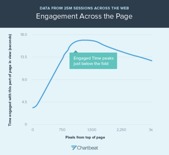
Typically, footers become afterthoughts when designing a new website. However, data shows that they can be another valuable place where users look to find information. Because the valuable content can often be further down the page, many users scroll down the page before it is fully loaded. When that happens, the pixels at the top of the page are viewed for the least amount of time. However, about 1200 pixels down is viewed for about three times as long as the top of the page. This is an often-overlooked opportunity for organizations to provide purposeful links as well as unique and engaging content.
Traditional footer navigation is located at the bottom of a website and mainly represented by text links. Some common items found in a footer include:
- Copyright
- Privacy Policy
- Terms of Use
- Contact Information
- Address Information
- Social Media Icons
- Email Signup
- Login (secure/account portal)
- Awards & Certifications
- Payment information (e-commerce)
- Call-To-Action
Footers are now typically designed to hold more information including many links across multiple columns – these are called “fat footers.”
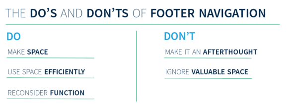
The Do’s and Don’ts of Footer Navigation
Footers can allow for navigation to internal pages or popular pages, and this additional navigation can also benefit SEO rankings. Therefore, it’s important to realize that a footer is valuable space on a webpage, but it’s just as important to know that it shouldn’t take away from any of your other content. Here are some essential “dos” and “don’ts” to keep in mind when designing a footer to ensure this doesn’t happen:
DO
- Make space – the footer should be a separate space and shouldn’t intrude on the content above it
- Use space efficiently – make use of the bottom of the page navigation
- Reconsider function – think of the footer as another spot for valuable links that your users frequent
DON’T
- Make it an afterthought – a footer shouldn’t be an afterthought or just a section full of links
- Ignore valuable space – the bottom of the webpage is still valuable real-estate
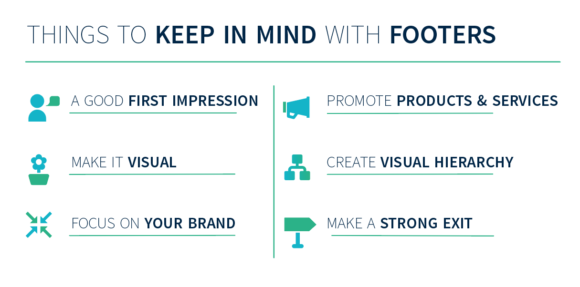
Some other important pieces to keep in mind when designing and generating tailored content for the footer are visual design, consistency, usability, and keeping it simple. A strong exit impression is critical as well. For many users, the footer is the last thing they see before leaving your site. Will the contents of your footer answer their questions and keep them on the site?
Mobile Considerations
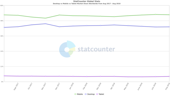
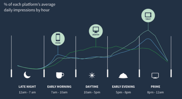
Navigation can look different across various devices, so it’s important to remember that you’re not just creating navigation for a desktop. In fact, according to StatCounter, mobile usage worldwide surpassed the use of desktop in 2016 and is continuing to grow. For example, according to StatCounter, in May 2018, mobile had a 52% impression share, desktop had 44.1%, and tablet had 3.89%.
Even with mobile being the impression share leader, this does not necessarily mean you should discontinue desktop use entirely. Let’s say you’re the typical 9-5 worker. You wake up in the morning and check the traffic, weather, and any missed notifications from the night before on your phone. Then, you get to the office and work at your desktop computer all day. Once you get home, you play games or send some personal emails on your iPad, and maybe read a few pages of an e-book before hitting the hay. Does that sound about right? If so, you’re right on trend with average device usage. Currently, mobile use trends depend on the time of day, as seen in the graph below.
When to use a hamburger menu?
Although the ‘hamburger icon’ is widely used in mobile responsive sites, there are ongoing questions about its usability. One A/B test found that using the word “Menu” performed better than using the hamburger icon.
Using bold and bright CTAs can draw the user’s eye on where to click. But, using a hamburger menu can keep navigation clean and simple. You can determine how to design a hamburger menu by gauging your audience in order to find what works best; however, it is important to keep mobile/responsive design and branding consistent with desktop.
If you want to learn more about this subject, check out our part one and part two discussions of website navigation. Or, if your website needs help with auditing, testing, and developing custom navigations, contact our team at 248-687-7888 or inquiry@mediag.com, we can help with recommendations, strategies, and implementation services. We are experienced in all things web since 1996!

.png)