Stay up to Date on All Things Tech

Your Website Has a Federal Accessibility Deadline. Here’s What That Actually Means.
June 8th, 2026
For the first time, the federal government has set a specific technical standard for public institution websites. If your organization is a public school, university, or government agency, the clock is running. By Media Genesis If you manage a website for a ... Read More

Google Just Changed How People Find You. Here’s What It Means.
May 22nd, 2026
The search box your business has relied on for twenty-five years is being rebuilt from the ground up. What Google announced at I/O 2026 is not a feature update. It is a different model entirely. Picture someone searching for a local ... Read More

Your Google Rankings Still Matter. But They Are No Longer Enough.
March 23rd, 2026
A practical guide to staying visible when AI answers the question before anyone clicks. Imagine this. You search Google for "best CRM for a small law firm." A year ago, you would have seen ten blue links and started clicking. Today, ... Read More

5 AI Shifts Businesses Should Start Paying Attention to Now
February 3rd, 2026
By John Torres
(Because 2026 Will Make Them Normal) From Novelty to Infrastructure Artificial intelligence is no longer in its “wow” phase. That stage of novelty, spectacle, and surface-level amazement is already fading. What’s replacing it is quieter, slower, and far more consequential. AI is ... Read More

Why Being Chosen by AI Is the New Measure of Visibility
January 15th, 2026
There was a time when being visible online meant ranking on Google. If you could land on page one, you had a fighting chance. Then the game evolved. Featured snippets appeared. “People Also Ask” boxes took over. Mobile search compressed ... Read More

What It Is, Why It Matters, and Why Your Website Keeps Asking for an Update
November 13th, 2025
If you run a business in 2025, you’re probably juggling a dozen platforms, dashboards, and tools already. So when your website suddenly starts nudging you about a “PHP update,” it’s fair to wonder: Why does this matter, and why now? Here’s ... Read More
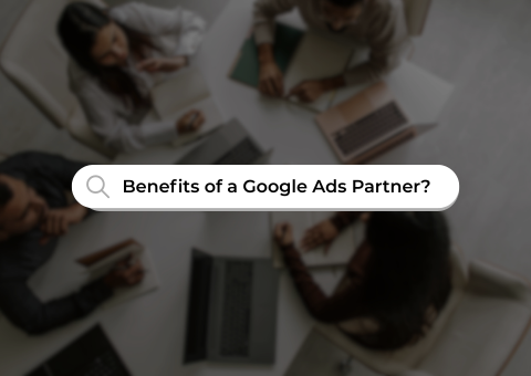
The Hidden Value of Working with a Certified Google Ads Partner Company
September 26th, 2025
In today’s fast-moving digital marketing world, standing out is tougher than ever. Businesses and marketing teams face constant competition for clicks, leads, and attention. One of the most effective ways to maximize online visibility and drive measurable results is through ... Read More
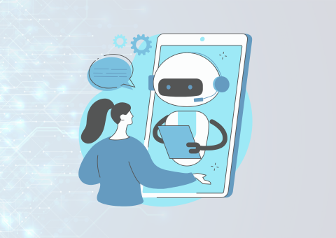
Can AI Build Your Website? (And Should It?)
August 27th, 2025
By John Torres, Media Genesis Director of Operations & AI Strategist
I get this question all the time: “Why can’t we just have AI make the website?” Usually, it’s at a conference where every corner is buzzing about AI, from animated hallway conversations to the latest keynote speeches. There have been ... Read More

GDPR, AI, and Website Design: What Businesses Need to Know in 2025
July 25th, 2025
Since its enforcement in 2018, the General Data Protection Regulation (GDPR) has reshaped how companies collect, store, and use personal data. With over €5.88 billion in fines issued to date, including Meta’s record-setting €1.2 billion fine in 2023, GDPR enforcement ... Read More

Popular Screen Resolutions: Designing for All – An Update
April 15th, 2025
In a previous blog, we discussed the importance of designing for a wide range of screen sizes to deliver a seamless user experience. As technology evolves and new devices come onto the market, it’s crucial to keep our responsive design ... Read More
Next Page »

.png)